ShopDreamUp AI ArtDreamUp
Deviation Actions


![[CLOSED] Baby wyverns](https://images-wixmp-ed30a86b8c4ca887773594c2.wixmp.com/f/f56dd00b-9543-4d48-967f-e08a7b1f85e0/dc5rmod-0c369e3d-707d-4bb6-8770-f5dfa3cdfdd2.png/v1/crop/w_184,h_184,x_0,y_35,scl_0.13142857142857/_closed__baby_wyverns_by_cakeindafridge_dc5rmod-92s-2x.png?token=eyJ0eXAiOiJKV1QiLCJhbGciOiJIUzI1NiJ9.eyJzdWIiOiJ1cm46YXBwOjdlMGQxODg5ODIyNjQzNzNhNWYwZDQxNWVhMGQyNmUwIiwiaXNzIjoidXJuOmFwcDo3ZTBkMTg4OTgyMjY0MzczYTVmMGQ0MTVlYTBkMjZlMCIsIm9iaiI6W1t7ImhlaWdodCI6Ijw9MjQ1MCIsInBhdGgiOiJcL2ZcL2Y1NmRkMDBiLTk1NDMtNGQ0OC05NjdmLWUwOGE3YjFmODVlMFwvZGM1cm1vZC0wYzM2OWUzZC03MDdkLTRiYjYtODc3MC1mNWRmYTNjZGZkZDIucG5nIiwid2lkdGgiOiI8PTE0MDAifV1dLCJhdWQiOlsidXJuOnNlcnZpY2U6aW1hZ2Uub3BlcmF0aW9ucyJdfQ.nk8viB9vI22Y1B67crjIrZMC89evhVwErLOn9qlN2S0)
![[CLOSED] Baby wyverns](https://images-wixmp-ed30a86b8c4ca887773594c2.wixmp.com/f/f56dd00b-9543-4d48-967f-e08a7b1f85e0/dc5rmod-0c369e3d-707d-4bb6-8770-f5dfa3cdfdd2.png/v1/crop/w_92,h_92,x_0,y_17,scl_0.065714285714286/_closed__baby_wyverns_by_cakeindafridge_dc5rmod-92s.png?token=eyJ0eXAiOiJKV1QiLCJhbGciOiJIUzI1NiJ9.eyJzdWIiOiJ1cm46YXBwOjdlMGQxODg5ODIyNjQzNzNhNWYwZDQxNWVhMGQyNmUwIiwiaXNzIjoidXJuOmFwcDo3ZTBkMTg4OTgyMjY0MzczYTVmMGQ0MTVlYTBkMjZlMCIsIm9iaiI6W1t7ImhlaWdodCI6Ijw9MjQ1MCIsInBhdGgiOiJcL2ZcL2Y1NmRkMDBiLTk1NDMtNGQ0OC05NjdmLWUwOGE3YjFmODVlMFwvZGM1cm1vZC0wYzM2OWUzZC03MDdkLTRiYjYtODc3MC1mNWRmYTNjZGZkZDIucG5nIiwid2lkdGgiOiI8PTE0MDAifV1dLCJhdWQiOlsidXJuOnNlcnZpY2U6aW1hZ2Uub3BlcmF0aW9ucyJdfQ.nk8viB9vI22Y1B67crjIrZMC89evhVwErLOn9qlN2S0)


Comments2
Join the community to add your comment. Already a deviant? Log In
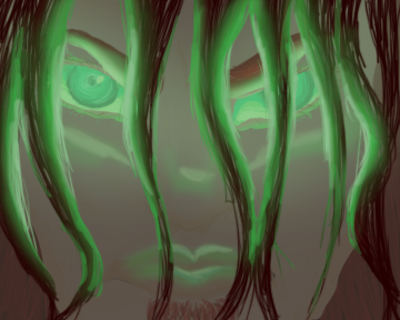
i think in areas like the lips and the eyes there should be higher contrast to better define the eyes and mouth. right now everything looks evenly spaced out as far as contrast goes and is giving it an unwanted airbrushy look.
compositionally, the hair in his face could be better thought out. yeah, its hair and hair would probably naturally clump like that, but right now it doesn't look like his hair naturally parts anywhere and all the hair clumps are roughly the same size. you should mix the sizes up a big to give it a more interesting feel for the viewer to look upon. I dont think the two locks of hair in the middle of the face would fall like that since the hair is really curly.
A green light like that on his skin would most likely give his flesh more of a green tone rather than green light in small areas on his flesh tone.
It looks cropped in in an uncomfortable manner. If you want to get a dramatic effect, you should zoom in more on the eyes, whereas if you wanted to show more of the face and hair like you seem to want to, you should probably zoom out a little more giving the viewer more to look at.
anyway, i hope this helps some and I hope to see a revised version (Smile)")
compositionally, the hair in his face could be better thought out. yeah, its hair and hair would probably naturally clump like that, but right now it doesn't look like his hair naturally parts anywhere and all the hair clumps are roughly the same size. you should mix the sizes up a big to give it a more interesting feel for the viewer to look upon. I dont think the two locks of hair in the middle of the face would fall like that since the hair is really curly.
A green light like that on his skin would most likely give his flesh more of a green tone rather than green light in small areas on his flesh tone.
It looks cropped in in an uncomfortable manner. If you want to get a dramatic effect, you should zoom in more on the eyes, whereas if you wanted to show more of the face and hair like you seem to want to, you should probably zoom out a little more giving the viewer more to look at.
anyway, i hope this helps some and I hope to see a revised version